The Client
ConveYour is a microlearning platform that enables influencers, trainers, and organizations to engage with their audience in a new and effective way—with personalized, bite-size content; mobile-first courses and campaigns; and interactive challenges. By tailoring their content to the specific needs of their audience, companies using ConveYour build a deeper connection to them.
Solution
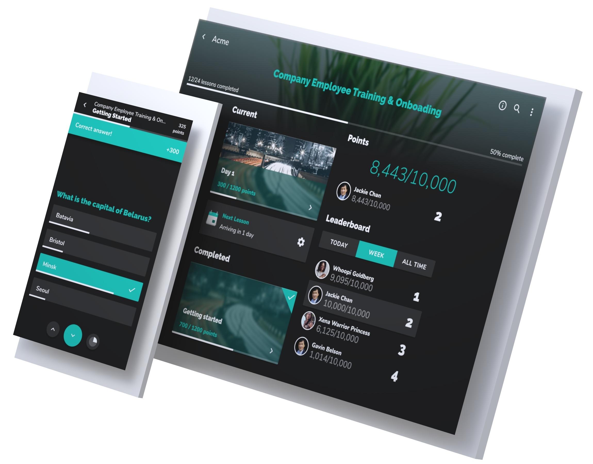
We started our work with ConveYour by doing an audit of their existing design and UX. From there, we established a set of initial goals for a complete redesign of the Learning Portal section of their app. We worked closely with ConveYour to improve the structure, navigation, and feature set of the product.

The redesign was not only an aesthetic refresh, but also the establishment of a growing library of design components, patterns, and assets for use in the current Learning Portal. When the redesign was completed, we worked directly with ConveYour’s developers to support and oversee the implementation. We continue to work with ConveYour on improvements to their app as well as new, unannounced projects.
Supported Platforms
Services
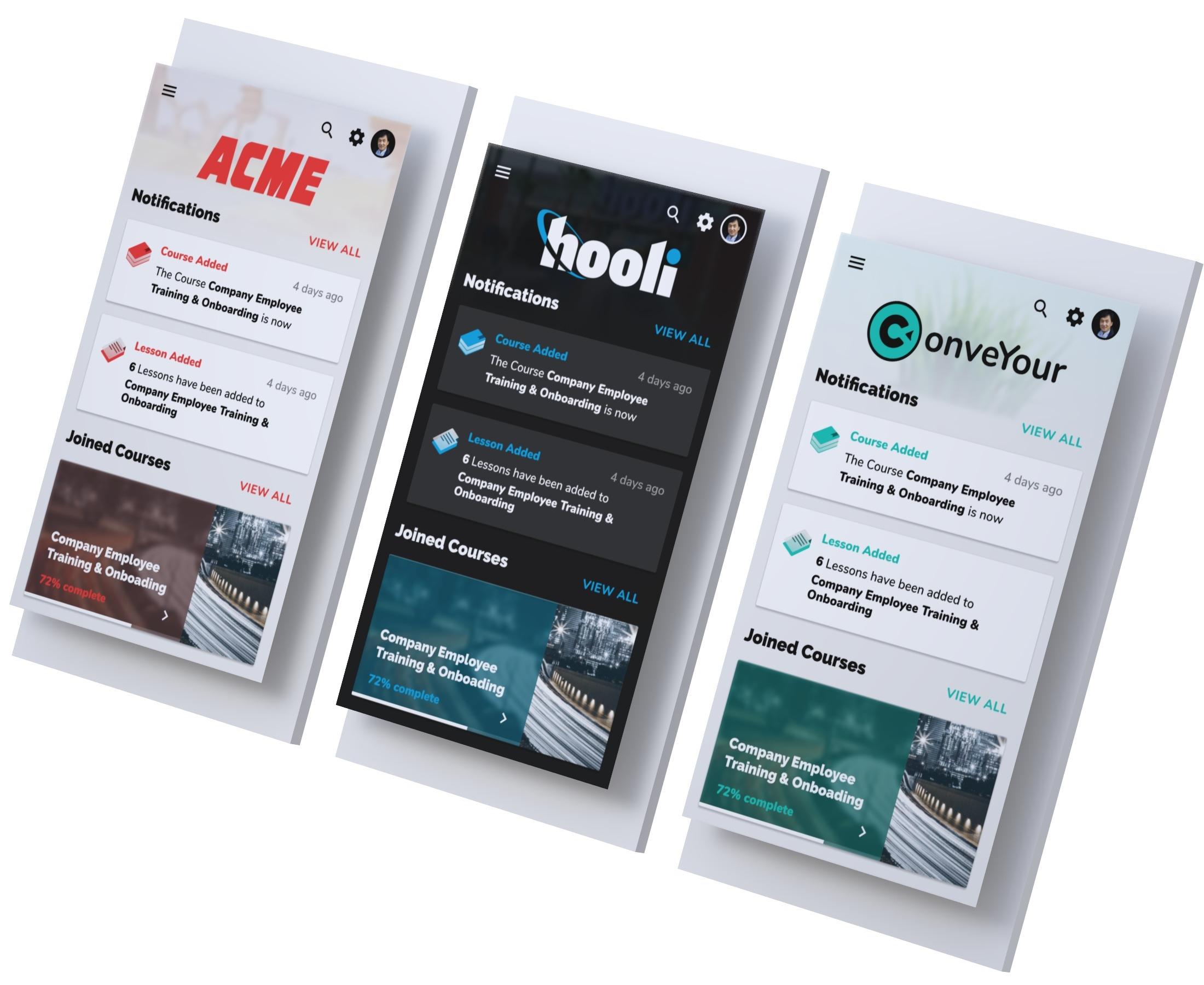
Themes and Whitelabeling
Our redesign needed to accommodate and improve the performance of the Learning Portal’s light and dark themes, as well as allow users to set their own primary color and logo. We designed sets of interface elements that worked well in both light and dark modes, and established a balanced, consistent use of primary colors while maintaining high contrast for key content.

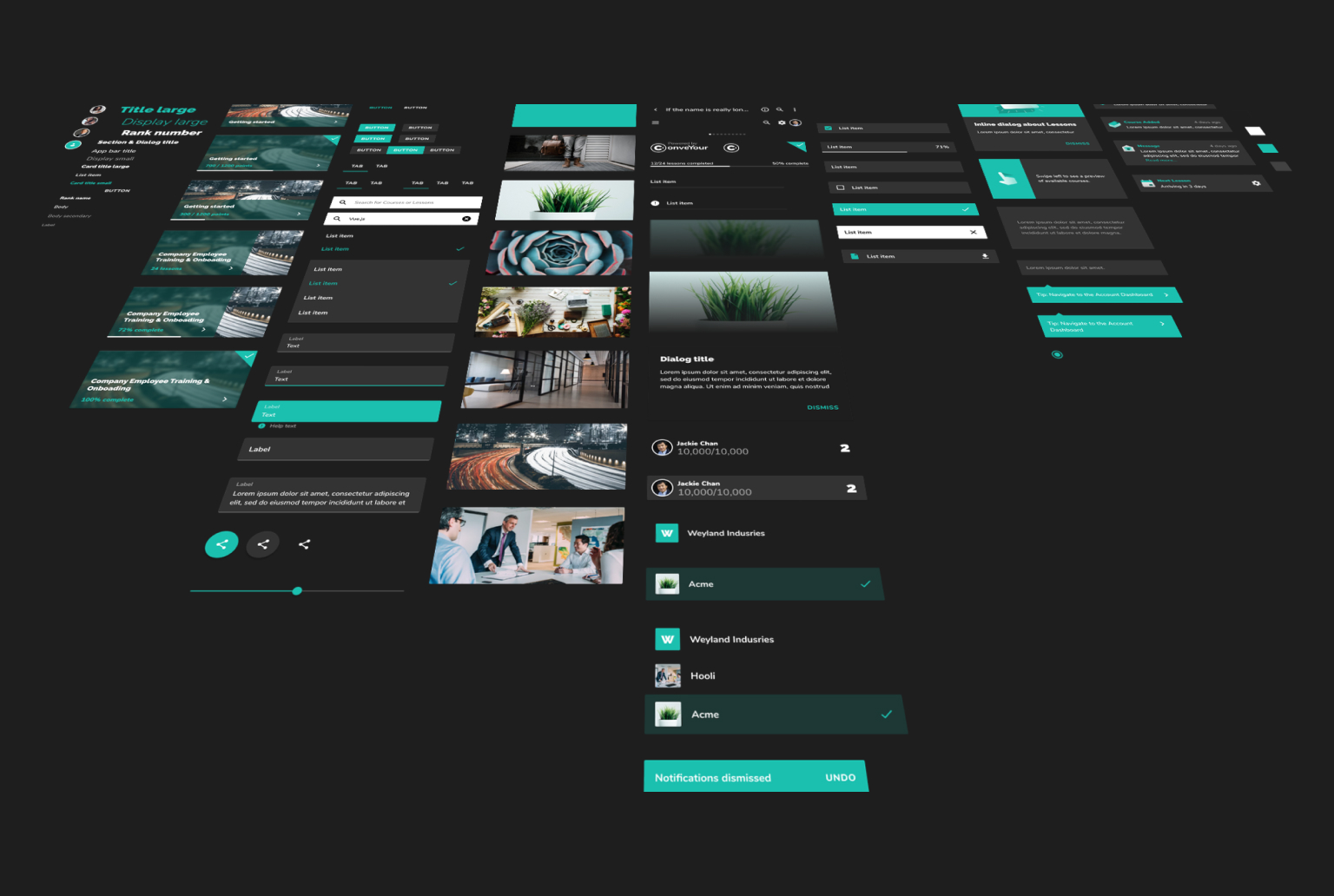
Design Library
Underneath the new interface is a collection of improved and expanded design components, navigation patterns, and graphic assets. These elements accommodate responsiveness and themeability. Items in the library are then built out as Vue components, enabling ConveYour’s developers to jumpstart the creation of new features and products.
